Being Hard Headed Is My Curse
-----------------------
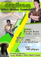
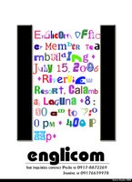
This morning, I crammed another poster supposedly for our organization's officer member teambuilding since my first one was rejected for being poor in aesthetics, poor in cropping, bad glow effects and the like. (hello, beginner with no photoshop - not to mention a decent computer, at home, i really believe i did a pretty good job!)
This is my first attempt.

This is the one I tried this morning.
Apparently, my higher officials found it deviating from its supposed "criterion" of order and aesthetics. It does not serve its purpose as a poster, in fact it's a pain in the eye for most, I believe. Unfortunately, I get so hard-headed at times, that I wanted to at least post it here.. I'm proud of this, and even if they aren't.. I guess, this poster is NOT for anybody else's pleasure, BUT FOR MY OWN.
It's my chance to experiment and to learn, to grasp my style. If they or anybody else do not like it, then so be it. If I have to leave my committee because I can't really make myself useful by trying to be helpful, then I guess I'm not really meant to conform with people - I don't know, I just can't make people happy with the things I do, or the work I produce. DAMN IT.


5 Comments:
:D haha... do i hear van gogh? haha:D muni-muni-muni... hahaha
muchos gracias amiga... :D
thanks jenn so much! :D
i know im supposed to write a comment but i just dont feel it coming, hahaha
anyways, i've shared what i think about it in our previous conversations =p
i know, useless comment, haha
It isn't about how well you photoshop. It's about how to bring one whole design to convey your message. One of my profs used to ask us to draw our ideas on paper, then let him check and criticize it before we are allowed to render it in photoshop. Brainstorming on one piece of paper helps. Don't think that it's going to be harder on paper or double the work. It is SO worth it ESPECIALLY if you do it AHEAD of time so that someone can check it for you before you go ahead with photoshop. In fact, in the real world, graphic designers usually draw their drafts to show to clients BEFORE they go to their computers. :)
haze.. um... i have this sketch pad and it's just simply full of my rough drafts, I come up with at least three different versions of one project - not to mention upgrades on each individual version. And I have some of my peers take a look see on what they think, but things always looks so good on paper.. right? The computer and the paper are two really different mediums. Things don't always come out as they appear. Everything is so new I just end up deviating from my original work because I couldn't find the right technique to make it come out.
But right now, I'm actually learning how to download brushes and fonts, tutorials and the like. I hope somehow that will improve my works.
God, I'm such a stupid head.
Post a Comment
<< Home